Version 1
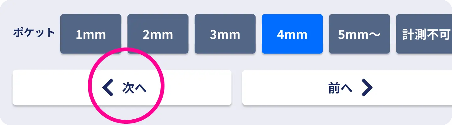
Press “Next”
After selecting a value, the user pressed “Next” to confirm. Each action took about 0.5 seconds, adding more than 90 seconds across 192 items, so I rejected it.
I designed a tablet interface for recording up to 192 periodontal measurements in under five minutes. “Faster than paper” was the adoption requirement. Each prototype was tested with dentists and refined with feedback from the dental hygienists who perform the input, reducing hand and eye movement and improving examination speed by 24%.
* Comparison of time required to enter the same examination items on paper and with the prototype.
01 Performance Requirement
Digitizing a familiar paper form was not enough.
The product had to make input both faster and more reliable than paper.
Context
A periodontal examination records up to 192 measurements, including pocket depth. Traditionally, results were written on paper and then copied into the electronic health record. The entire process had to fit within five minutes, leaving almost no spare time.
Business Requirement
In Japanese dental care, spending longer on an examination does not increase reimbursement. Reducing examination time, and therefore chair time, directly improves productivity.
02 Iterate the Input
Validation Loop
Dentists operated every prototype of the input and feedback interface. We checked clinical correctness, finger and eye movement, input rhythm, and whether the current position was always clear. I rebuilt the interaction after each session and put the next version back in their hands.
Feedback from the dental hygienists who perform the input kept the work grounded in real clinical use, not theoretical usability.
Version 1
After selecting a value, the user pressed “Next” to confirm. Each action took about 0.5 seconds, adding more than 90 seconds across 192 items, so I rejected it.
Version 2
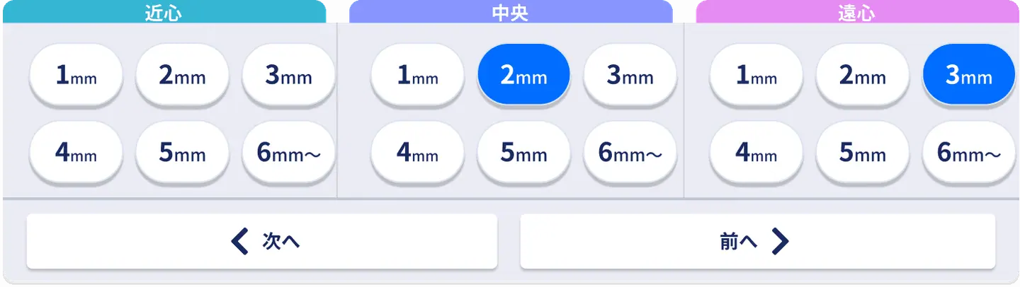
This version grouped three entries before advancing. It increased finger movement and required users to keep watching the screen to find buttons, so I rejected it.
Version 3
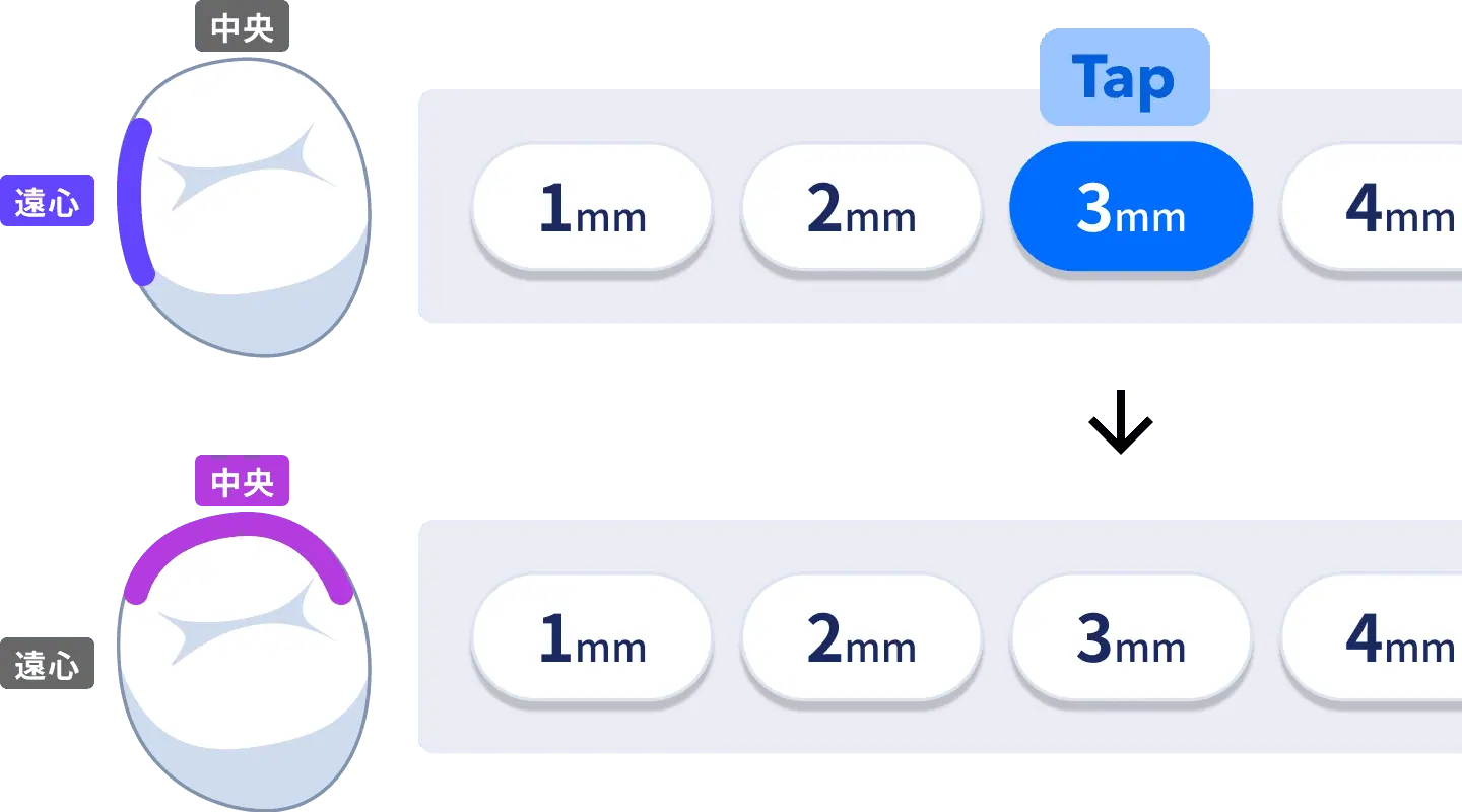
The interface advanced automatically after each value. Removing the Next action was highly rated by dental hygienists, so I adopted the behavior.
Version 4
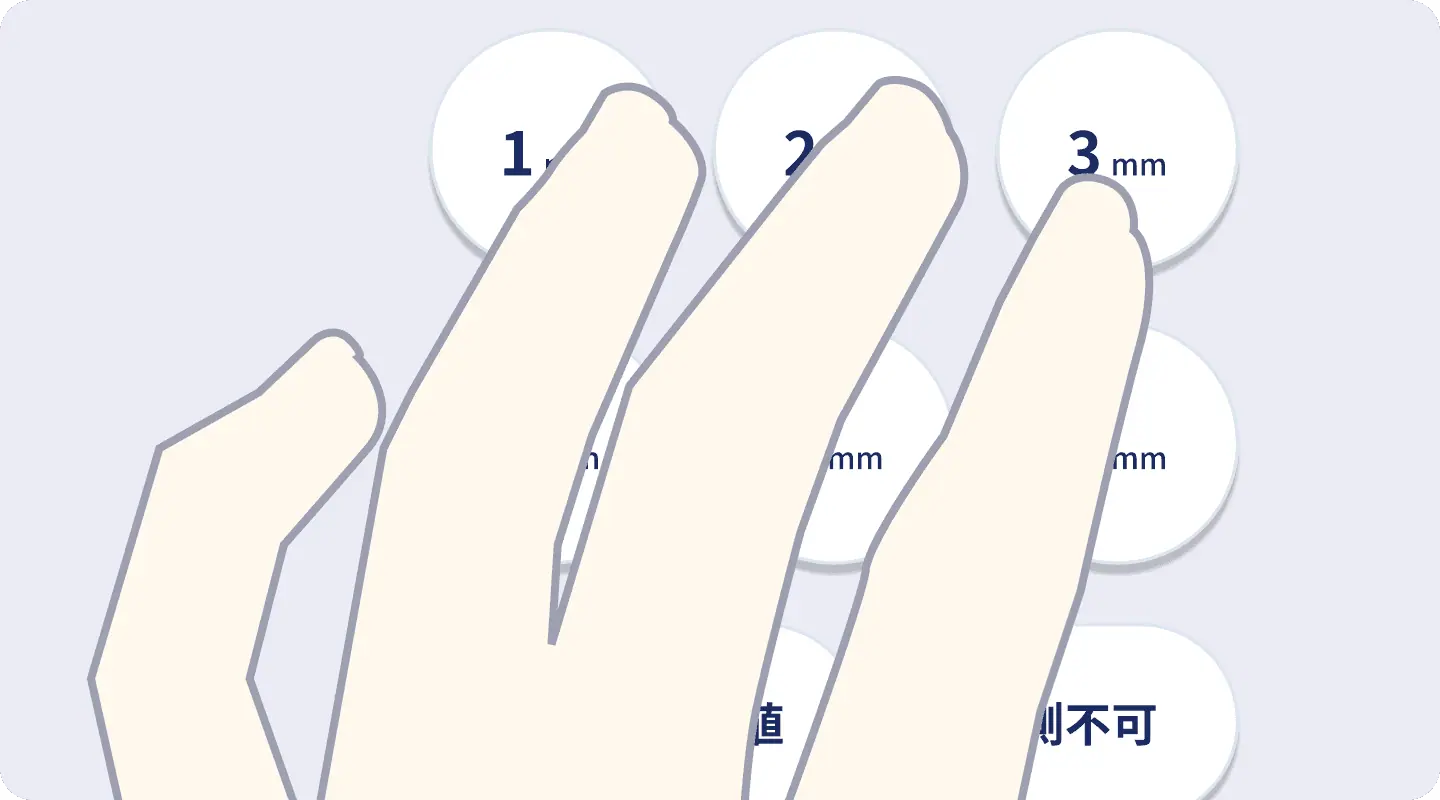
I arranged values like a numeric keypad so users could enter data continuously without moving their hand or breaking rhythm.
Version 5
I tested sizes that let the index, middle, and ring fingers rest naturally, settling on 96px to minimize movement while preventing mistakes.
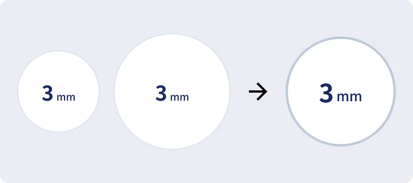
Final
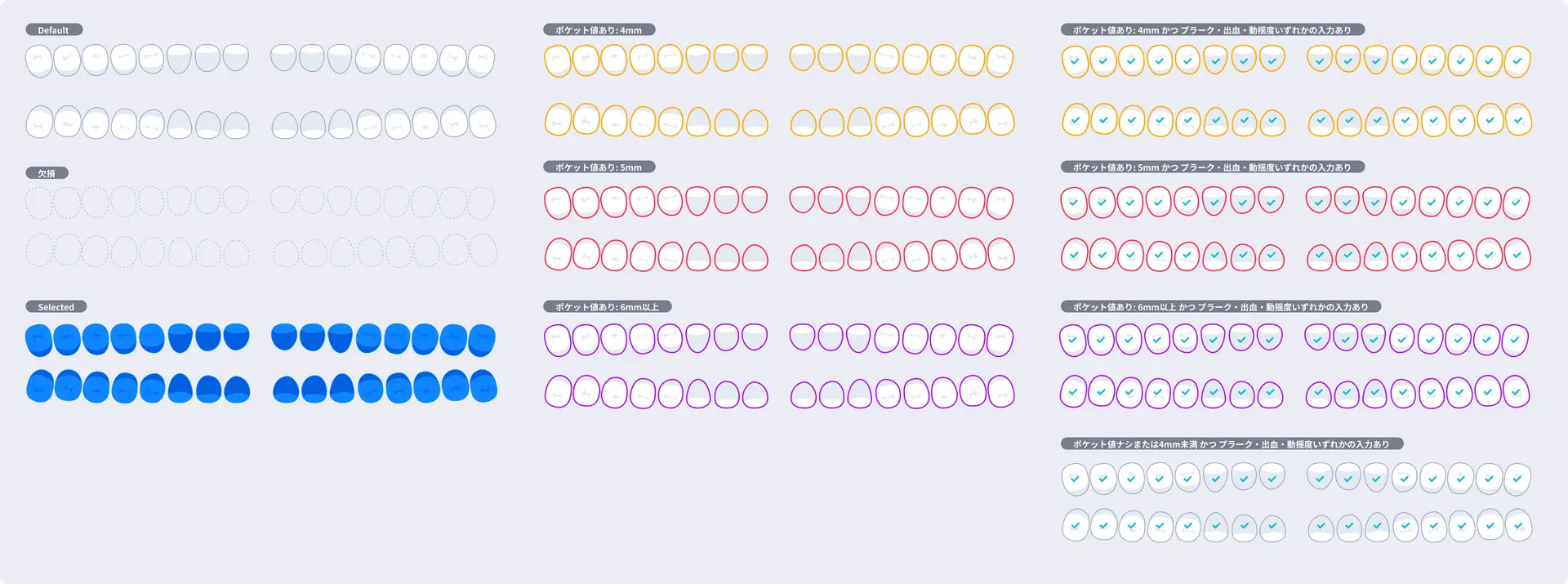
I reduced the size of infrequent, abnormal values to prevent accidental taps. Values of 4mm and above, which indicate periodontal risk, use a warning color so they are identifiable during input.
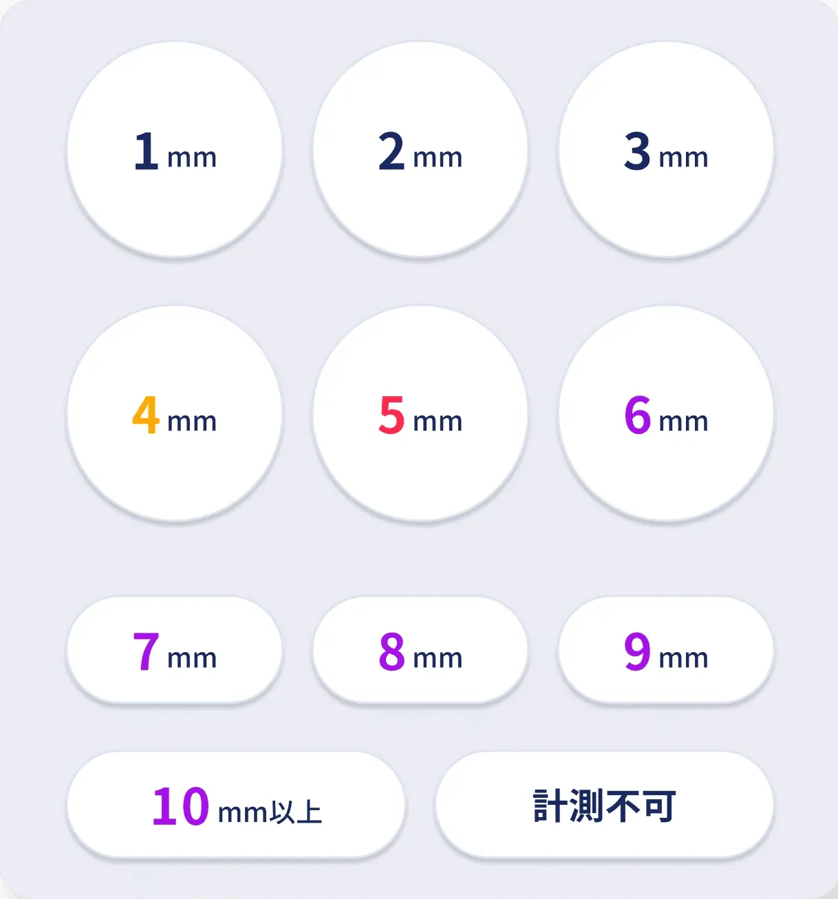
03 Iterate the Feedback
Speed alone was not enough. Clinicians needed to confirm the current tooth and completed results without shifting their gaze across the screen.
I translated the scanability of the paper chart into a digital interface.
Version 1
The first version reproduced the familiar paper chart on a tablet. Feedback that familiarity did not make the format necessary prompted a search for a display designed for the device.
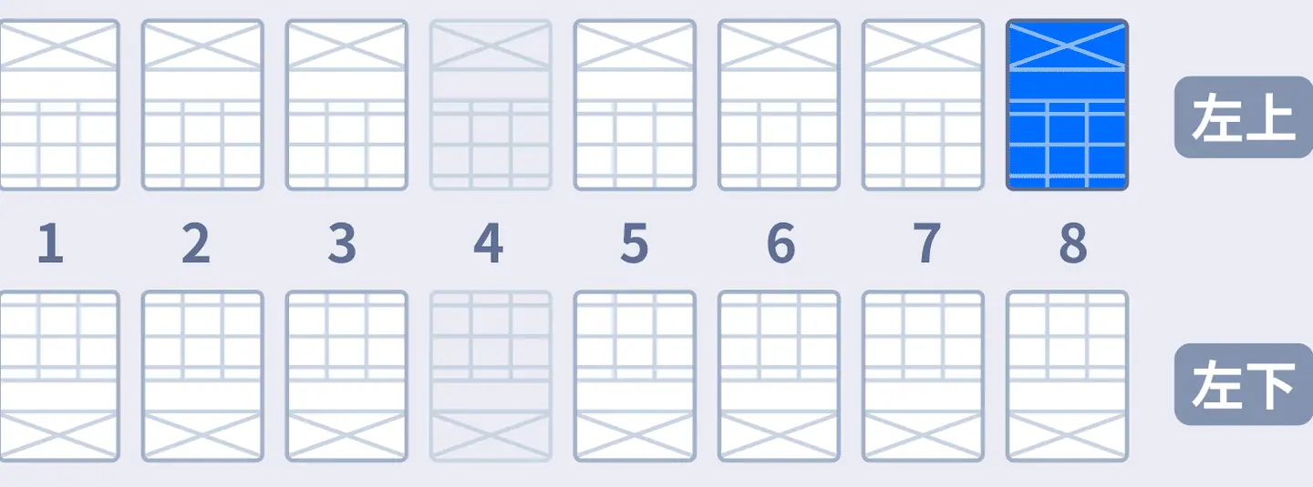
Version 2
An illustration of the jaw looked intuitive but made it difficult to identify the current tooth and surface, so I rejected it.
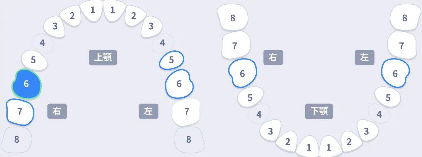
Version 3
Showing the active surface made the current position clear, but testing revealed that clinicians needed to see the upper and lower jaw together.
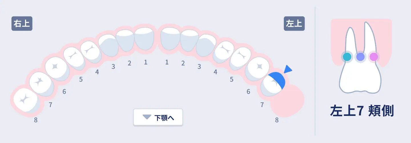
Version 4
I arranged the teeth in a single row so both jaws were visible at once, then limited feedback to preserve legibility.
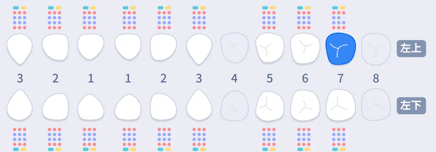
Final
The active surface appears in blue, completed values are kept minimal, and only values of 4mm or above are emphasized. Clinicians can see where they are and what they entered at a glance.
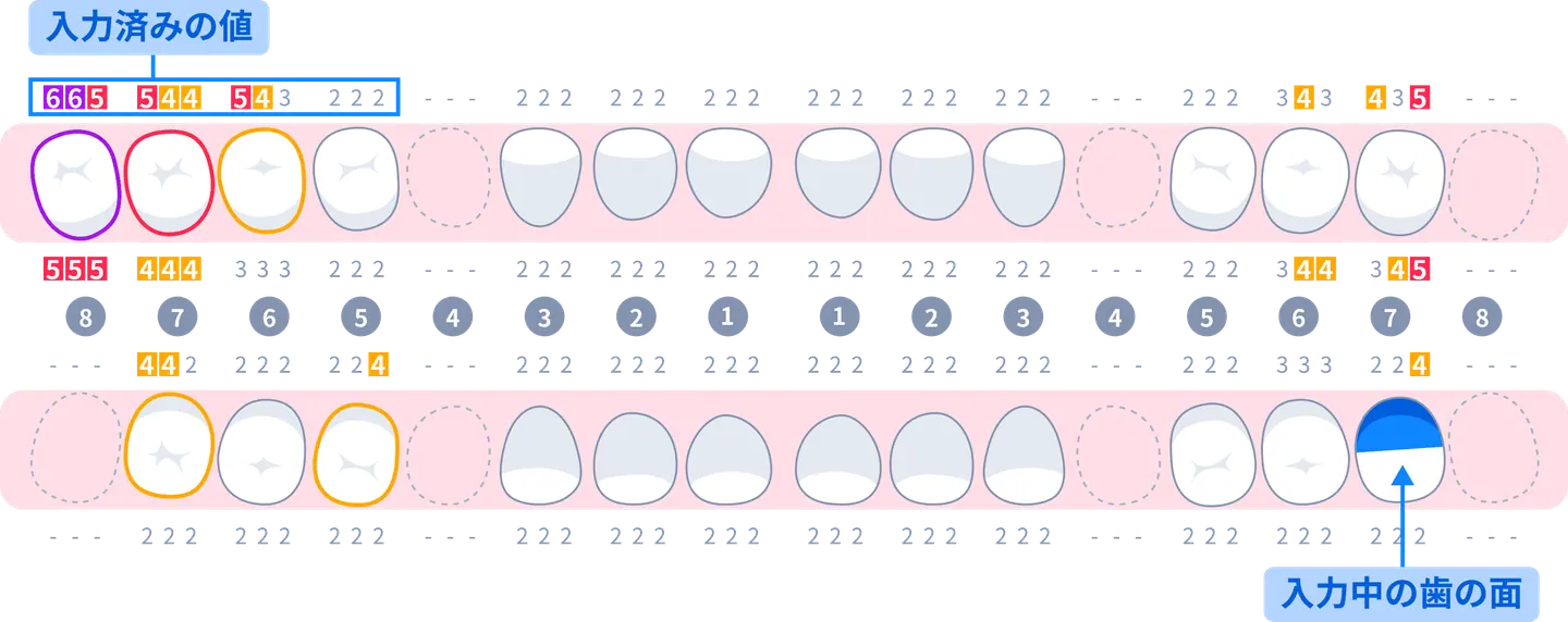
04 From Prototype to Specification
I carried each interaction beyond validation, translating what experts confirmed into specifications the team could implement.
The interaction testing I once conducted in Figma has since evolved into code-based prototypes with Claude Code, while screen specifications now live as implementations in Storybook.
Interactive Prototype
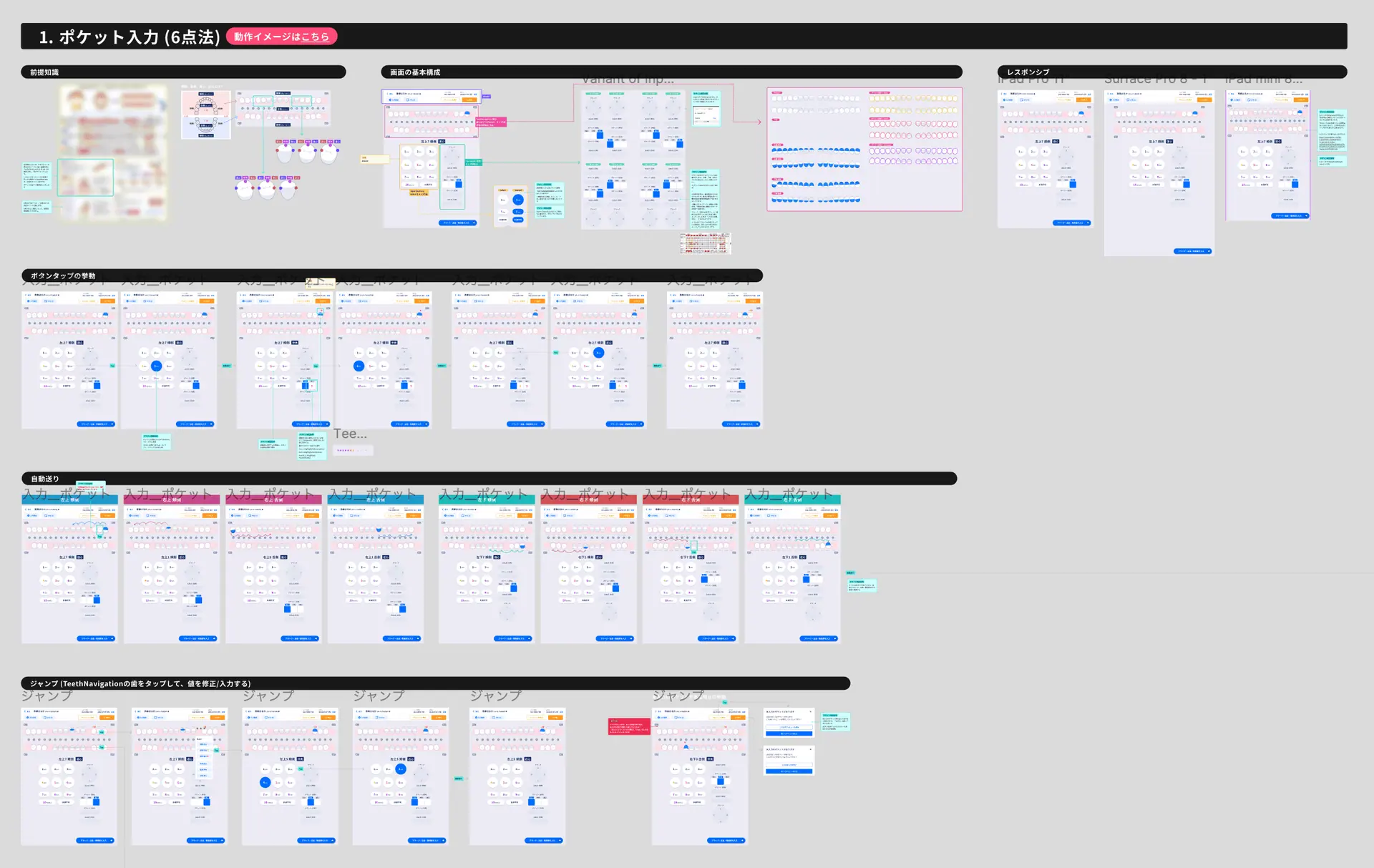
I reproduced real input behavior and transitions in Figma. Beyond dentist validation, the prototype let engineers experience the interaction and verify alignment with data structures and transitions before implementation.
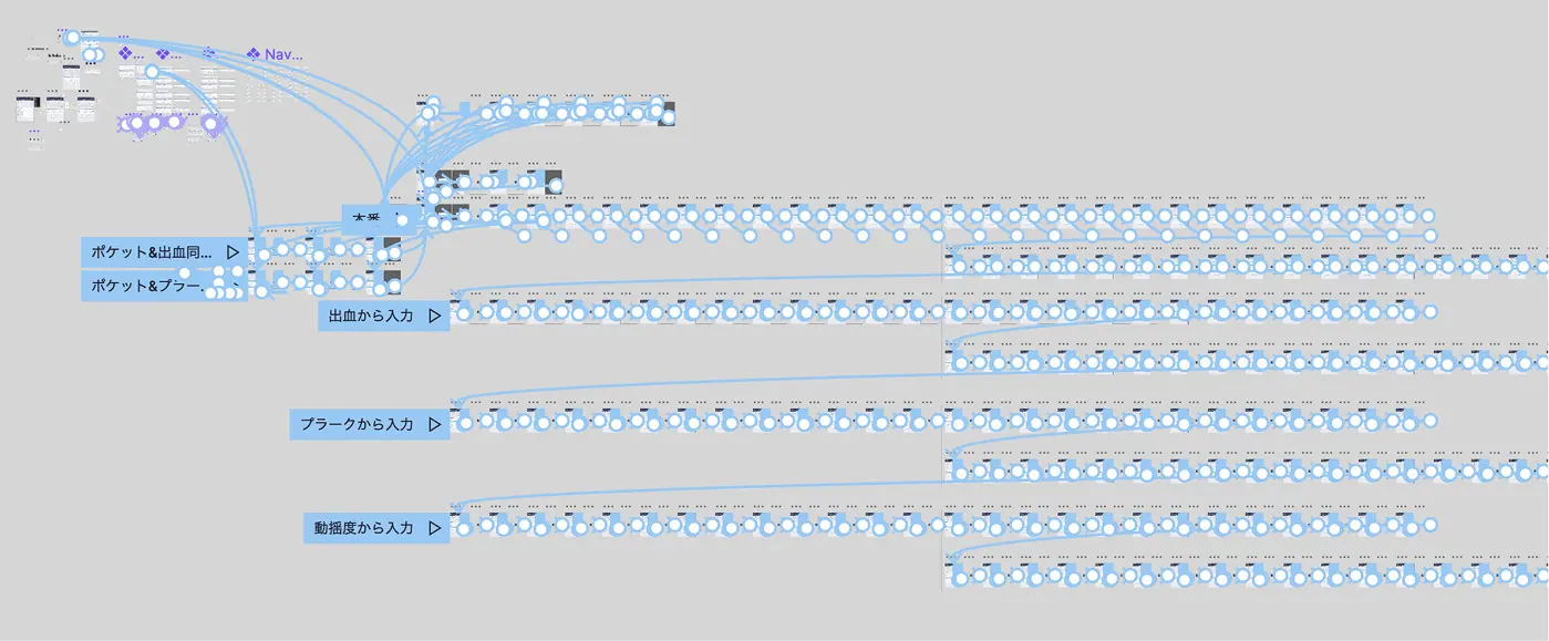
Design Specification
I defined the states produced during use, including entered values, selection, automatic advancement, feedback, and errors. After testing visibility, I named variables and states in Figma and organized them into components the development team could understand and implement.
05 Impact
Quantitative Impact
A fixed-hand input interface and immediate position feedback made examination input 24% faster than paper.
Qualitative Impact
Dentists and dental hygienists rated the experience “easier than paper.” It minimized hand and eye movement while preserving input rhythm and making position and results easy to confirm.